Thursday, December 4, 2008
Wednesday, November 19, 2008
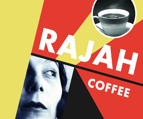
Rajah Coffee: New Typography Style!
This is a poster redesign I did for History of Modern Design. I had to redesign Livemont's Art Nouveau "Rajah Coffee" poster in the style of Jan Tschichold's New Typography movement.

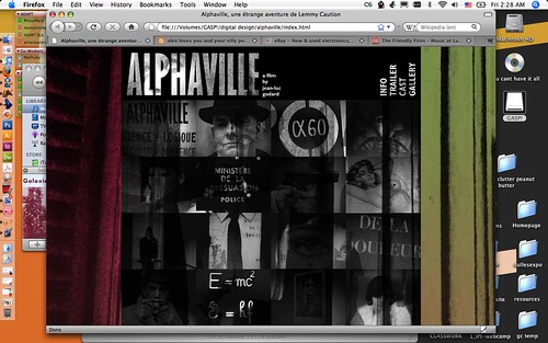
Alphaville website
I've started preliminary design and coding on my Alphaville website and I think I'm pretty happy with it so far. I've been using Photoshop and Dreamweaver to put it all together. There are still whole pages to finish and quite a bit more coding, as well as a script to add, but it's getting close to done! Here's what it looks like right now:

Labels:
Alphaville,
Dreamweaver,
website
Thursday, October 23, 2008
Roman Cieslewicz!
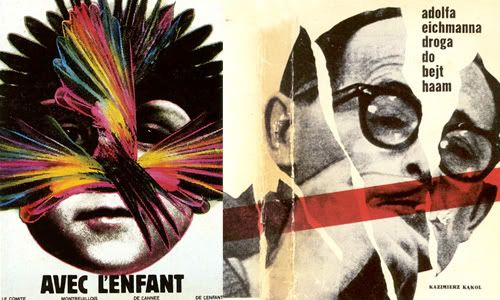
Two of Roman's posters: 1979 and 1962, respectively.
I recently came upon the work of Polish graphic designer Roman Cieslewicz and have become pretty obsessed with his poster design. His use of color and photo-montage is incredibly striking to me and his influence on my work in the future seems kind of inevitable...
Here's a very brief bio from polish-poster.com:
Roman Cieslewicz (1930-1996) In 1949-54 studied at Cracow Academy of Fine Arts. He specialized in poster and display designing. Worked as book and magazine designer. Since 1962 he lived in France where he worked as an art director of "Vogue", "Elle" and "Mafia" - advertising agency. He was the artistic creator of "Opus International" and "Kitsch". Member of AGI [International Graphic Association].
You can view several pieces of his work in THIS flickr set.
Labels:
graphic design,
influences,
Roman Cieslewicz
Thursday, October 16, 2008
Communications Exercise 2
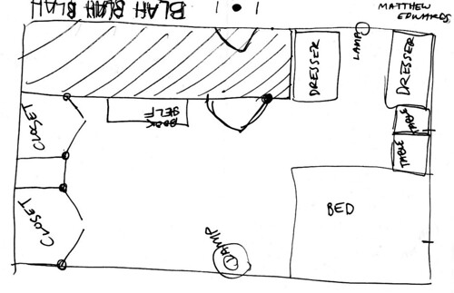
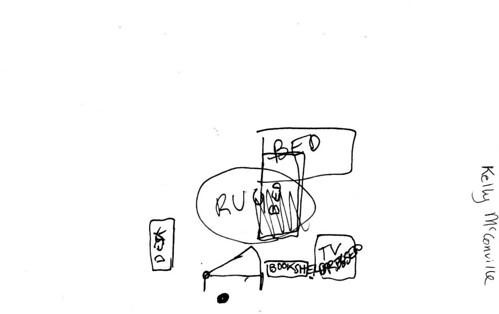
Last class we had another exercise on communicating clearly. The task was to partner up draw a schematic of our bedrooms. Then, only using words, we were to instruct our partner how our room was arranged so they could draw it as well. the results were then – mostly laughably – compared. Below is the my bedroom drawn by me. Below that is my drawing of my partner's bedroom. I did a pretty terrible job at rendering her bedroom the way it actually should have looked. A lesson learned, I suppose. Communicating your ideas, thoughts, instructions – anything – clearly is a very important thing.


Thursday, October 9, 2008
A New Header!

I recently designed a new header for my music blog Skatterbrain. I used the Affair typeface (available from Veer) in (almost) all caps, with some open-type alterations and heavy baseline and kerning adjustments. I think it came out pretty nice and hopefully not TOO busy.
Labels:
Skatterbrain
Friday, September 19, 2008
Assignment One: Poster Re-Design
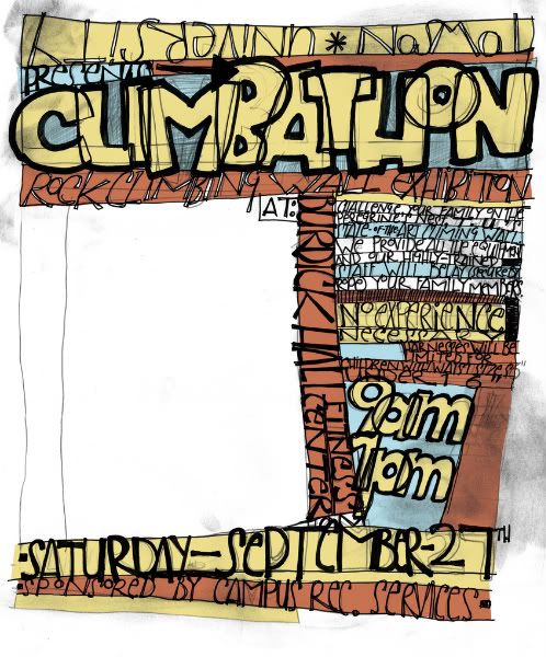
I chose Jay Ryan as my designer to "rip off" for this assignment. You should DEFINITELY check him out if you never have before. My poster design is below. Please note that it's not yet finished, but close!

Labels:
Digital Design,
Jay Ryan,
Poster,
The Bird Machine
Wednesday, September 17, 2008
A Modern Listener's Guide

Image from eveningtweed.com
Evening Tweed is a graphic design collective formed in late 2006 by four 2008 graduates of the University of Brighton. I've been following their work via their website for several months now and they've all done some very fascinating stuff. About a month ago I came upon this piece done by Jez Burrows and I'm still amazed by it. In her words...
"Asked to respond to the word banausic, I chose to take the most grandiose, wilfully complex thing I knew and express it as mechanically and cold as I could manage. 'Destroyer's Rubies' by Destroyer was that thing. I transcribed the entire album and produced an exhaustive collection of diagrams and analysis, including: every word contained in the album in order of how many times it appears; references; grammatical structure; and the overall distribution of lyrics and 'la's."
I missed out on the very small run of A1 screenprints she originally did and I'm still kicking myself. In any case, check out a few more photos of the print here, and be amazed by her admirably exhaustive design.
P.S. I apologize if Jez is actually a he, which I'm just now realizing is entirely possible.
Tuesday, September 9, 2008
Communications Quiz
In our first Digital Design class last Thursday we were given a communications quiz. It involved drawing situational coffee cups, and the way we described these various coffee cups in short amounts of time.
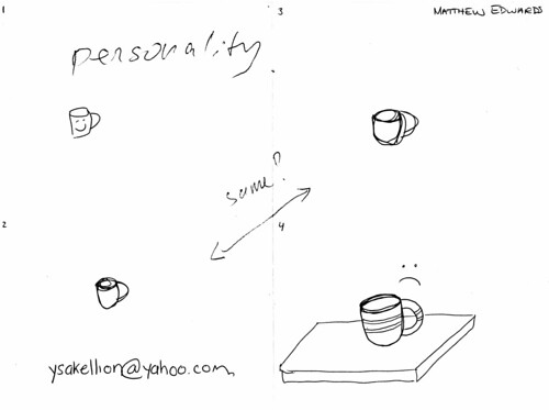
In quadrant one, I was told to draw a "coffee cup". There it is. Quadrant two was a "coffee cup half full of milk" and quadrant three, a "coffee cup half full of coffee". Well, if it were half full you would not be able to discern what is in it, so two completely nondescript coffee cups are what I drew. In quadrant four I was to draw an "empty coffee cup". A coffee cup with no coffee in it is a sad thing, and the frowning face illustrates this clearly.

In quadrant one, I was told to draw a "coffee cup". There it is. Quadrant two was a "coffee cup half full of milk" and quadrant three, a "coffee cup half full of coffee". Well, if it were half full you would not be able to discern what is in it, so two completely nondescript coffee cups are what I drew. In quadrant four I was to draw an "empty coffee cup". A coffee cup with no coffee in it is a sad thing, and the frowning face illustrates this clearly.
Labels:
coffee,
Digital Design
Monday, September 8, 2008
New Blog! Woo!
HELLO! I guess I'll be writing things here now.
Here are some of the more important things I should note right now:
Item 01. I write another blog called Skatterbrain. Skatterbrain is an indiepop-focused music blog where I write about my favorite songs and my favorite bands and all other things that end up intertwined between the two. I also make mixtapes regularly and post them there for downloading.
Item 02. I have a Flickr account which can be found HERE. There is a bit of a wild mess of things within the pages of my photostream there, but the majority of it is my recent school – as well as non-school – graphic design work (and otherwise).
Item 03. I will be posting a scan of my communications quiz in Digital Design tomorrow. Happy coffee, sad coffee :) :(
Labels:
Digital Design,
Flickr,
Skatterbrain
Subscribe to:
Posts (Atom)
